Most websites are not bad. They are simply difficult to remember. They follow familiar structures, use familiar layouts and repeat the same visual solutions. Everything works, but very little stays with you after the browser tab is closed.
When I began building The Issue №, I did not want to create another polished collection of screens. I wanted to create a real digital publication - something people could read, explore and return to. That changed the way I approached every decision, from typography and image placement to navigation, movement and page rhythm.
A website should not only function. It should communicate a point of view.
A beautiful interface is only the beginning. Without a clear idea behind it, even the most elegant design can feel interchangeable. What makes a digital experience memorable is not decoration, but intention. The structure, content and visual language must all support the same story.
Editorial thinking changes the structure
Editorial design begins with hierarchy. What should the reader notice first? Where should the eye pause? What deserves space, and what should remain quiet? These questions are just as important on a business website as they are in a magazine.
Instead of treating every section as an isolated block, I think about the complete reading experience. A strong opening creates curiosity. Typography establishes tone. Photography introduces atmosphere. White space gives the content room to breathe. Each part prepares the reader for the next.
Design and development belong together
A visual concept can look perfect as a static composition and still fail once it becomes a responsive website. Real screens move, resize and react. Text changes length. Images have different proportions. Components must work across devices.
That is why I approach a project from both a designer’s and a developer’s perspective. I consider visual hierarchy together with performance, responsiveness and reusable structure. The final experience should not feel like a design that was later forced into code. It should feel as though both were created as one system.
The Issue № as a working example
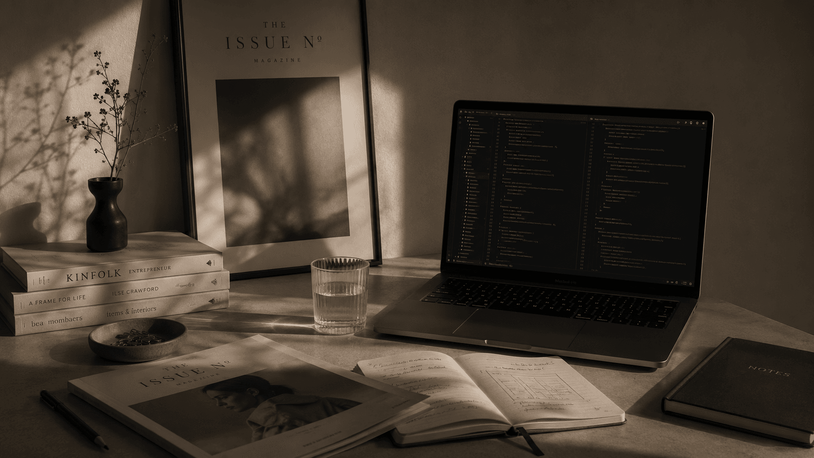
The Issue № became the place where I could test this approach in practice. It combines editorial storytelling, photography, UI/UX design and frontend development within one evolving product. Every new article, project and collaboration introduces a different challenge and helps the platform grow.
The goal was never to build something unusual simply for the sake of being different. The goal was to create a digital environment with its own character - one that supports the stories, people and projects published within it.
Memorable websites are not built from trends. They are built from clear ideas.
This is the kind of work I want to continue creating: websites where structure, visual identity, content and technology support one another. Not ordinary websites, but thoughtful digital experiences with a clear reason to exist.
Maria S.
Creative Developer · UI/UX Designer · Editorial Creative
Studio Journal — THE ISSUE N°
Editorial
Submit your story
Send us your pitch, article idea, or visual story. We are always open to new voices and personal perspectives.