When a client says, “I want it to feel more alive,” what exactly does that mean?
More colour? Stronger typography? Less empty space? Different photography?
Usually, none of these answers is quite right on its own.
One of the most interesting parts of working with small businesses is that clients rarely speak the language of design. And they shouldn't have to. They know their business, their customers and the feeling they want to create. The designer's job is to translate that feeling into a visual language.
I was reminded of this recently while developing the social media identity for a beauty salon in Helsinki.
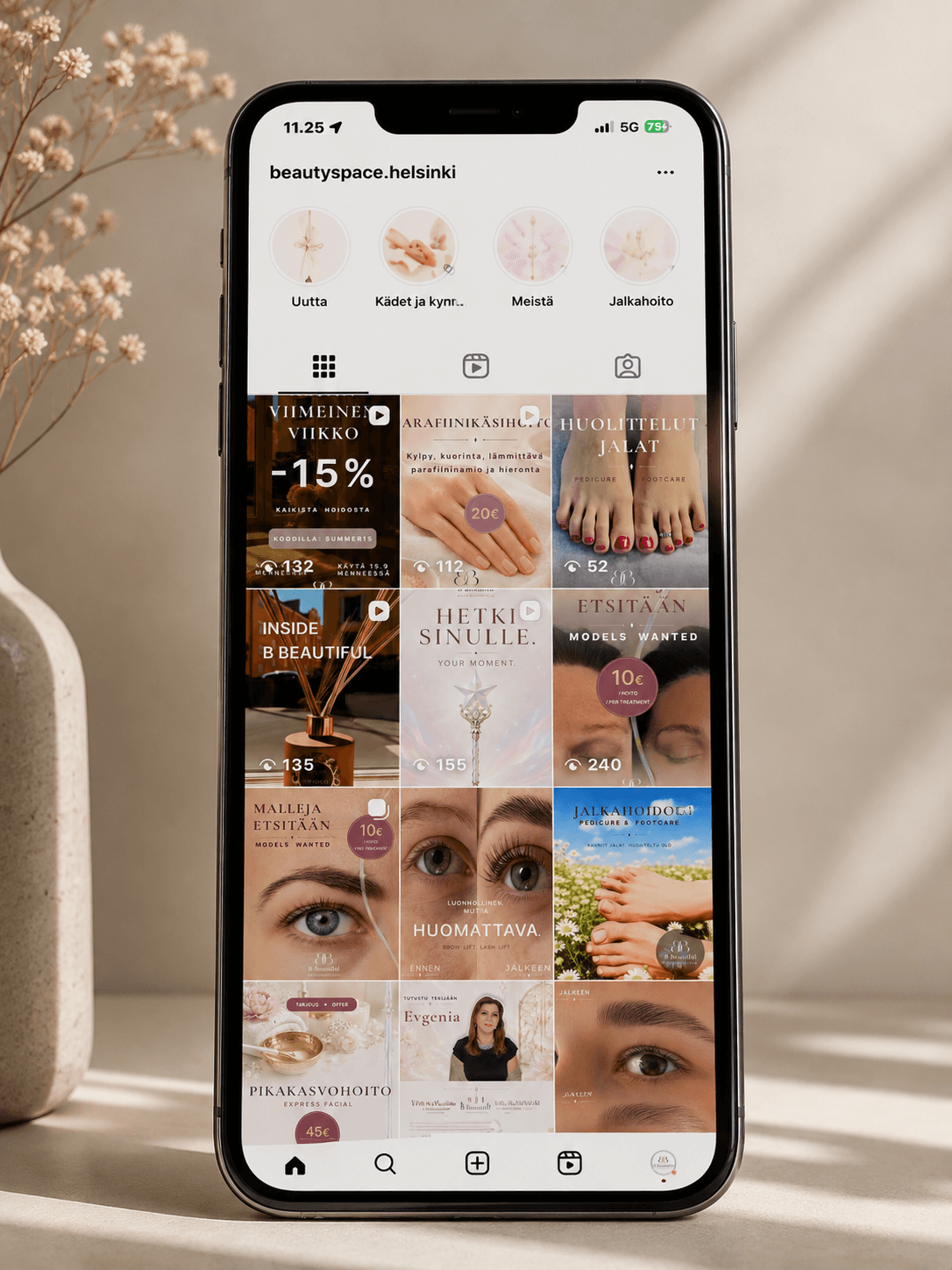
At first glance, the task seemed straightforward: create a coherent visual direction for Instagram and Facebook, introduce the salon and its treatments, and make the pages feel professional and recognisable.
But very quickly, the project became less about making social media posts and more about understanding what kind of brand this actually was.
The Brief Is Rarely the Whole Brief
A brief gives you information. A conversation gives you clues.
There is a difference.
A client may ask for something “elegant”, “fresh”, “soft”, “minimal” or “more alive”. These words are useful, but they are not a design system. Two people can say elegant and imagine completely different things.
This is where visual listening begins.
You listen not only to what the client asks for, but also to what they reject. You notice which references they return to. You look at their space, their existing materials, their website, their services and the way they communicate with customers.
Gradually, a visual personality begins to emerge.
A Brand Has an Address
One detail that can easily be underestimated in digital design is the physical location of the business.
But an address is part of a brand.
The salon I was designing for is located in Ullanlinna, one of Helsinki's established central neighbourhoods. That context matters. The surrounding architecture, businesses and clientele create certain expectations before a customer has even opened the door.
The digital identity has to understand those expectations.
A beauty business positioned in this environment should not feel cheap, overly promotional or visually chaotic. At the same time, “premium” does not have to mean black backgrounds, gold typography and obvious luxury codes.
In fact, trying too hard to look expensive often creates the opposite impression.
For this project, premium needed to feel quieter.
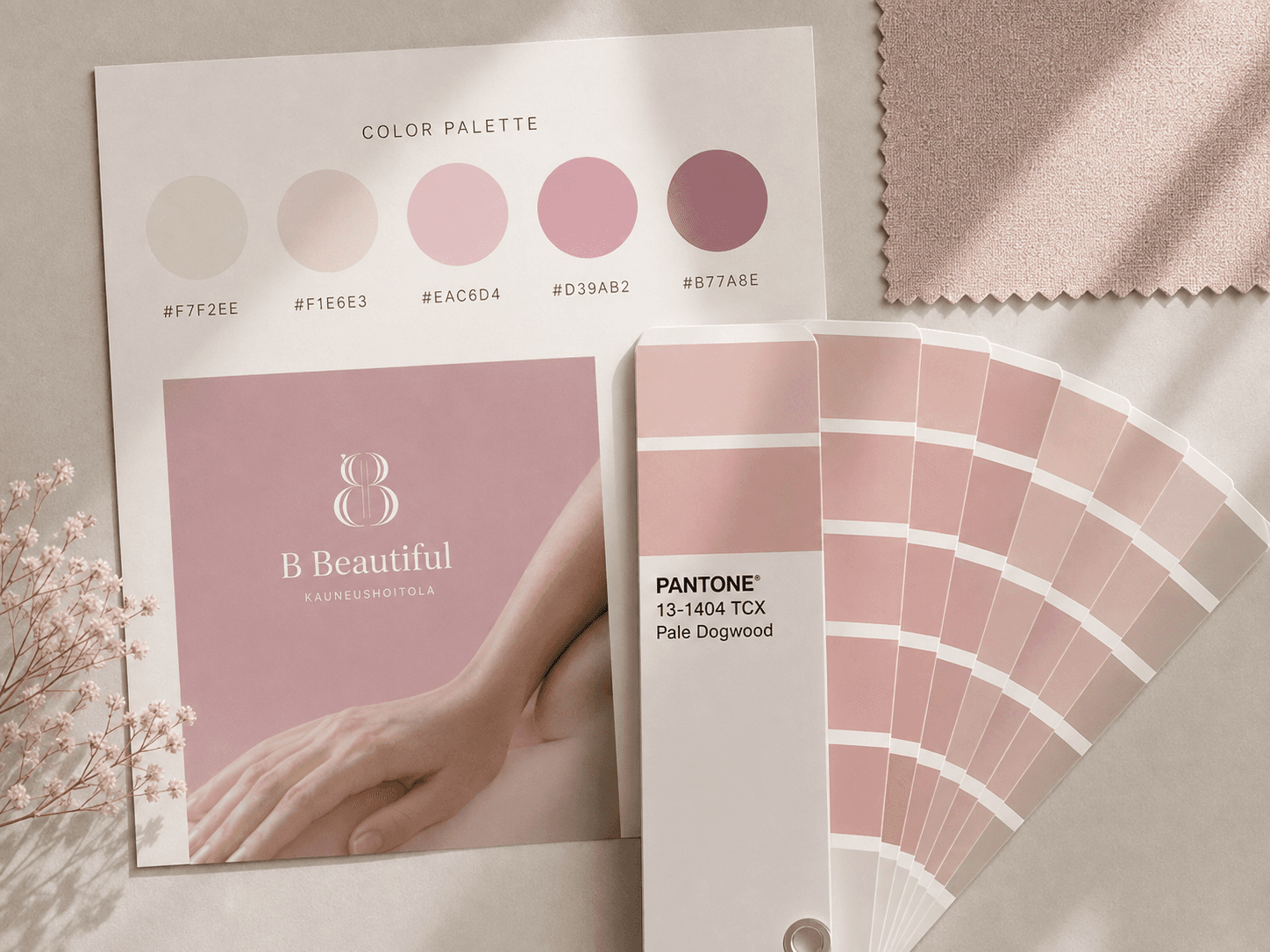
More space. More restraint. Carefully selected photography. A controlled palette. Typography with enough confidence not to compete for attention.
The goal was not to announce luxury.
It was to let the brand behave as though quality was already expected.
Premium Is Not a Style
This became one of the most useful questions during the process:
What makes something look premium without explicitly trying to look luxurious?
For me, the answer increasingly comes down to confidence and consistency.
Premium design knows what to leave out.
It doesn't need five fonts, ten colours and a promotional badge in every corner. It doesn't need to make every element equally loud.
Instead, it creates hierarchy.
One image can dominate. One sentence can have space around it. One carefully chosen detail can do more than several decorative elements.
This is especially important in beauty and wellness, where there is a very thin line between looking approachable and looking inexpensive - or between looking sophisticated and becoming cold and clinical.
Finding that balance became part of the concept.
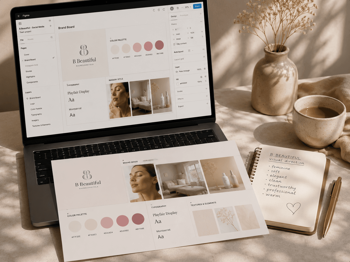
Then Something Clicked
During the process, the client showed me the salon's new website.
And suddenly, several things became much clearer.
It wasn't that the website gave me a ready-made design to copy. It did something more useful: it revealed the visual world the client had been trying to describe.
I could see the direction more clearly - the softness, the brightness, the level of minimalism, and the relationship between professionalism and warmth.
I realised that my first interpretation wasn't necessarily bad.
It simply wasn't completely theirs.
That distinction matters.
One of the hardest lessons in design is learning that a beautiful solution can still be the wrong solution.
Designing for the Business, Not for the Designer
It is very easy for designers to become attached to an aesthetic.
We have favourite typefaces, compositions, colours and visual references. And when something looks beautiful on our screen, it is tempting to defend it.
But the client is not hiring us to demonstrate our personal taste.
The design has to belong to the business.
For a local beauty salon, that means considering much more than whether an Instagram grid looks attractive.
Who walks through the door? What does a treatment cost? Where is the salon located? How does the physical space feel? What level of service does the customer expect? Does the brand need to feel exclusive, approachable, clinical, intimate - or some careful combination of all four?
A successful visual identity sits somewhere at the intersection of those answers.
Social Media Is Part of the Interior
There is another reason this matters particularly for beauty businesses.
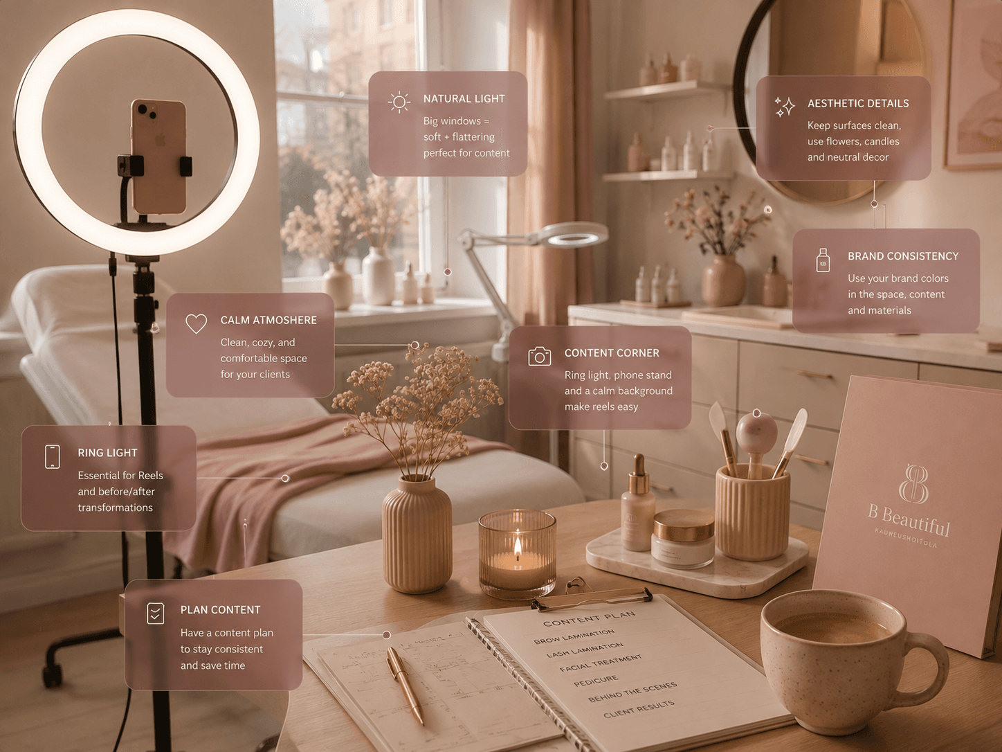
For many new customers, Instagram is effectively the first room of the salon.
They enter it before they enter the physical space.
They see the colours, faces, treatments, photography and language. Within seconds, they form an expectation about the experience and, often unconsciously, about the price level.
If the physical salon communicates care and quality while its digital presence communicates discount offers and visual noise, there is a disconnect.
The opposite is equally problematic: an extremely polished luxury identity can create expectations that the actual experience was never designed to meet.
Good branding reduces that distance.
The Instagram page, website, treatment room and customer experience do not need to look identical.
But they should feel as though they belong to the same world.
Visual Listening
This is why I have started thinking about this part of design as visual listening.
It happens before the final palette.
Before the typography.
Sometimes even before the designer fully understands what the project is supposed to look like.
You collect signals.
The client's words. The things they dislike. Their location. Their audience. Their prices. Their personality. Their physical space. Existing materials. Competitors. References.
And somewhere between all those fragments, the brand begins to become visible.
The designer's role is not always to invent it.
Sometimes the more interesting job is to recognise it.
The Designer as Translator
I don't think a designer's job is to impose a style on a business.
It is to find a visual language for something that already exists - perhaps as an idea, an atmosphere or simply a feeling the client hasn't yet learned how to describe.
That requires design skills, of course.
But it also requires curiosity.
Observation.
And the willingness to change direction when new information changes your understanding of the project.
Because sometimes the most important moment in the design process isn't when the client says:
“That's beautiful.”
It's when they look at something and say:
“Yes. That's us.”
Maria S.
Creative Developer · UI/UX Designer
Editorial
Submit your story
Send us your pitch, article idea, or visual story. We are always open to new voices and personal perspectives.